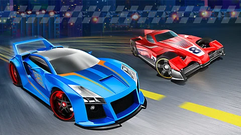
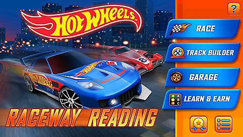
Hot Wheels: Raceway Reading
The UI & UX design details of Hot Wheels that made the experience engaging and accessible.
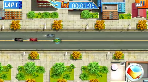
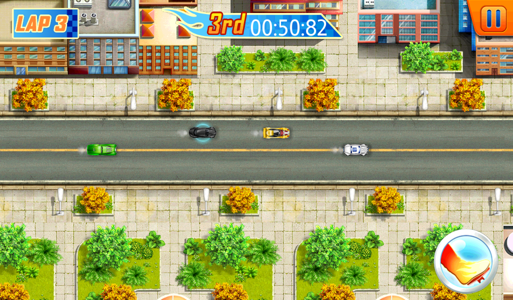
Hot Wheels is a "one button" top down racing game that teaches literacy to 5-8 year olds. The game is loaded with many features: 100 cars, a track editor, multiplayer head to head racing option, multiple literacy subjects, a stand alone option to play curricular games. With so many features we had in the game it was important for us to be consistent, simple, and clear about how to do everything in the game. In addition to the normal balancing of driving mechanics, AI balancing, and economy system we paid close attention to the UI and UX design details of the game so the interaction is enjoyable useable. In this write up I'll walk you through how we took away player agency and then gave it back simplified to create a more engaging experience. The goal is to give the player just enough challenge and control to feel engaged.
We'll talk about:
Simplifying the multiplayer experience: Racing and Sharing Tracks
Game and User Interaction Controls
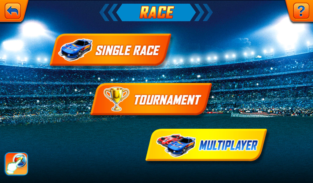
Simplifying Multiplayer Initiation:
Here's the flow of how we got multiplayer to work in a simple manner.
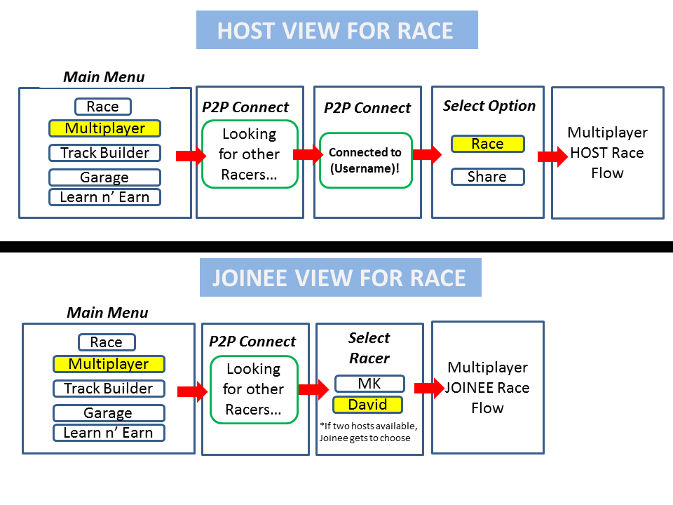

One of the biggest challenge when designing for this demographic is how to deal with their limited ability to troubleshoot tech and coordinate all the events to make it all work. Our goal was to get the players into the game as quickly as possible. Knowing this we made the multiplayer aspect as simple by reducing options they had to make and made the events happen automatically without having to give the player many choices.
The flow chart above shows the flow of the Host and Joinee. Each of the players have a max of two choices to make and then they're in the game. This is how we determined Host and Joinee.
Host: Select Multiplayer first to become Host automatically.
Joinee: Select Multiplayer second and becomes Joinee. (We gave the option to the Joinee to choose from two host when available.)
Multiplayer Flow:
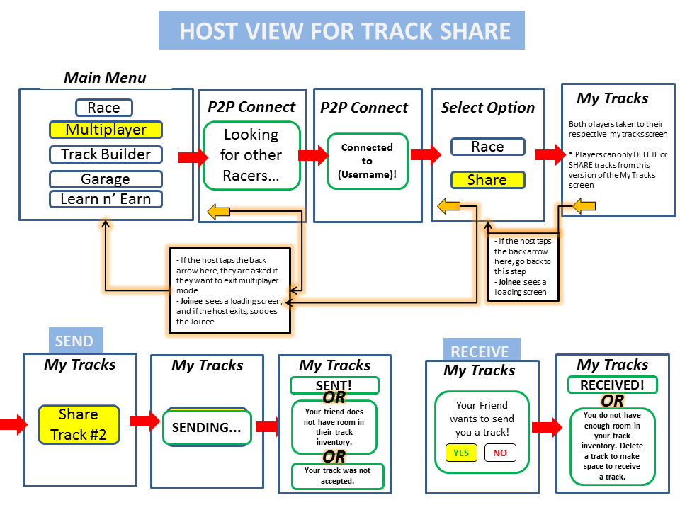
Here is the full flow once players are connected. Again we took the approach of minimizing the choices each player had to make. The flow represents the flowchart for Racing and Sharing tracks.
Click to Enlarge View
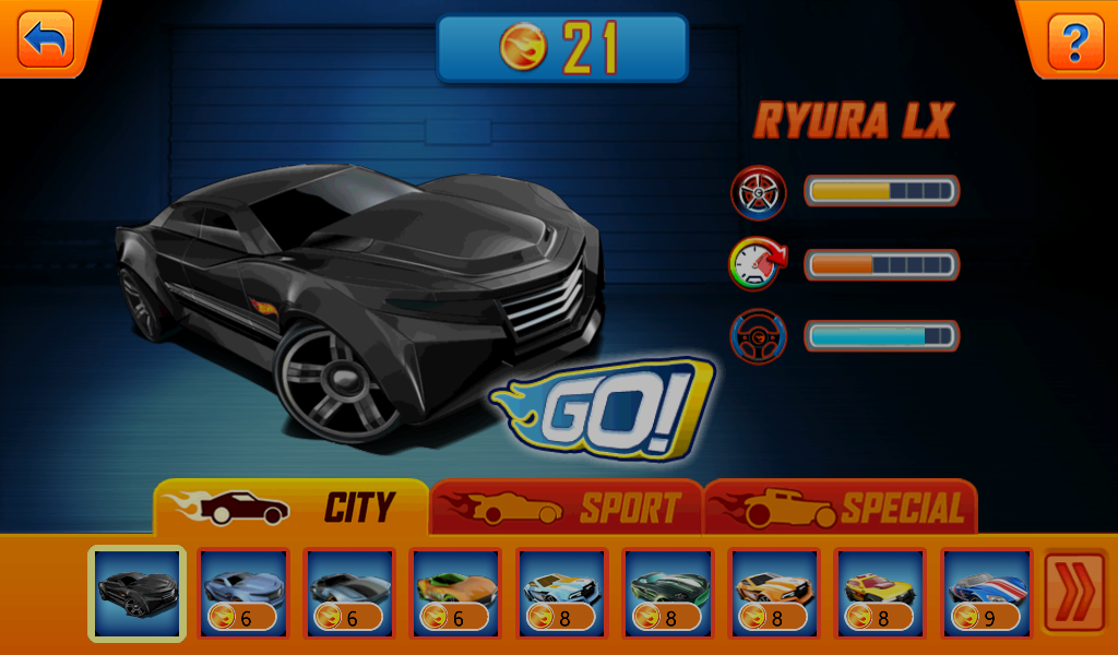
Racing Mode:
Just as easy it is to setup multiplayer we wanted to echo the simplicity getting into games.
Player actions:
Host: Chooses which car and then which track to race on.
Joinee: The player only needs to choose their car.
Here are the final screens for multiplayer flow - Host screen flow

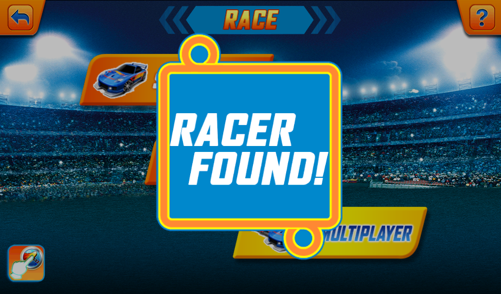


Here are the final screens for multiplayer flow - Joinee Flow


Multiplayer Share a Track Mode:
Player Actions:
Host: Chooses which track to share.
Joinee: Chooses to accept or not. (In Share a track mode we chose not to allow the Joinee to share a track and only gave that ability to the host. It was tech constraint but the design preference was to allow both players to share back and forth.)
Here are the final screens for the track sharing flow - Host Flow


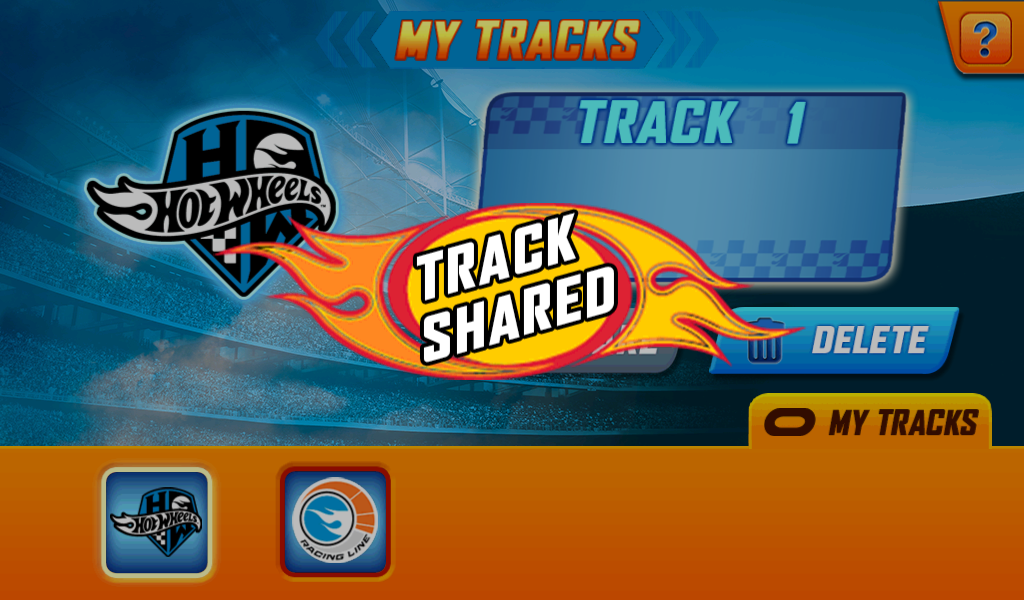
Here are the final screens for the track sharing flow - Joinee Flow


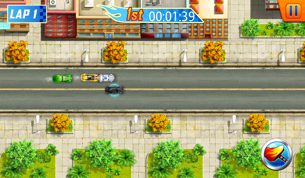
Simplicity in Controls
Tap and hold anywhere onscreen to go. Lift up to brake and drift.
One of user experience design pillars of the game is to keep it simple by not asking the player to multitask with the interactions. We wanted to keep the cognitive and the physical workload minimal in order to boost engagement at the desired areas of the game.
First, in order to simplify the interaction we had to compensate in many areas through clever automation; however, at the same time give the players a way to slightly influence those elements that were automated to give them a sense of autonomy. This is important for the 5-8 year old age group.
My first example is the driving mechanic. We believed that the fun in the core interaction is accelerating and braking and the physical reaction of the car. Instead of typically having a game where there were multiple controls to steer, accelerate, brake, and boost we collapsed the controls into two actions: accelerating and braking which was done by tapping and then un-tapping the screen. Tap to go, un-tap to stop and drift.
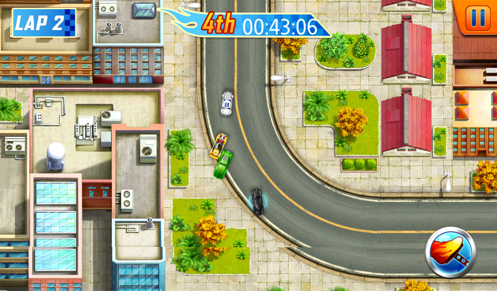
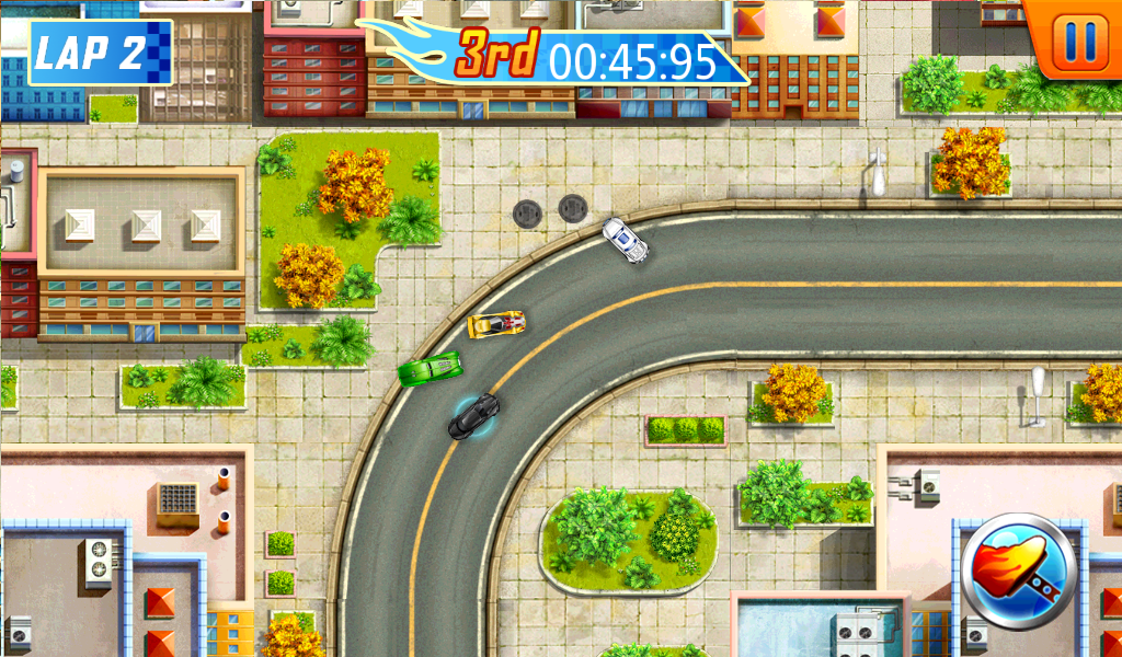
We put the car on rails and did smart logic and tuned the physics that allowed the player to control and move off rails when drifting at a turn area. This made the player truly feel like they had control over the car's movement. Giving them control at important parts of the game became the theme and rule. Turning areas are usually the critical points on the track and allowing the kids to control that was important.
We validated many of these ideas through several qualitative A/B testing in LeapFrog's Kid's Lab. We made tweaks to the tuning parameters for drifting and testing them against a controlled build and many variations. When we finally got the physics right in the game, the outcome was that kids did not mind not being able to steer constantly. They were thoroughly engaged with simply accelerating and braking to drift at the right time to pass up cars. This was a simple interaction to learn but hard to master because it asked the kids to pay attention to timing and judge when to do the two simple actions.


Let's dig into some nerdy details of the UI; the design of the circular gas pedal. This is a little nit picky detail, but I think it makes the overall feel of the screen better. With that said let's talk a little about form and function. Preferably you want to model things in the game where people may already have a mental model of in the real world. It leaves people wondering and asking less question and getting into the product easily.
In real life the gas pedal is a vertical rectangle while the brake pedal is a horizontal pedal. This makes sense, the vertical orientation aligns with the direction the car is going and in contrast the horizontal orientation of the brake is misaligned with the direction of the car; however, this only makes sense if the perspective of the user is behind the wheel. Hot Wheels has a top down perspective and the perspective of the car to the user can be multi-directional. The orientation changes constantly. A rectangular pedal wouldn't feel right so we made it circular; additionally it looks like a button that can be pressed, it's a soft shape with two interaction states: Pressed and Non-Pressed. The visual feedback loop clear. It's a small change but I believe it made the overall game feel better.
While doing usability testing we found that kids' fingers usually drifted away from the gas button because they were fully engaged in the race. They would get frustrated because they would suddenly lose racing position because they slowed down "randomly" or worst lose the game and not know why because to them they were still pressing on the screen. We fixed this by making the whole screen a hot spot (minus the navigation menu). The player can tap and hold anywhere onscreen and their car will go.
Summary
Prior to the fixes and suggestion of multiplayer flow the user wanted to quit the test session after the first couple of games. With the fixes to the game mechanics and flow, we saw a great turn around with 90 to 95% of participants more engaged with the game and wanted to continue to play long after the testing session was over. When kids want to continue to play unprompted that's a great feeling and a win!
Hot Wheels Raceway Reading
Curriculum: Reading
Demographic: Age 5-8
Platform: LeapPad Platinum
“He loves to make tracks and earn cars, especially finding delight in the fact that he has some of the hotwheel cars in the game. I love that it makes him spell and make words in order to race and earn points!
Pros:
Fun for kids, Grows with child, Good for on-the-go play, Educational”