Epic Kids: Retention Via Monthly-to-Annual Upsell Channel
Background
Epic Kids is a digital reading platform that offers a subscription service with the goal to make books accessible to all kids. With Epic Unlimited subscription, kids can access thousands of books, videos, and quizzes to fuel their curiosity and help them on their reading journey on any platform: Web, iOS, Android.
Problem
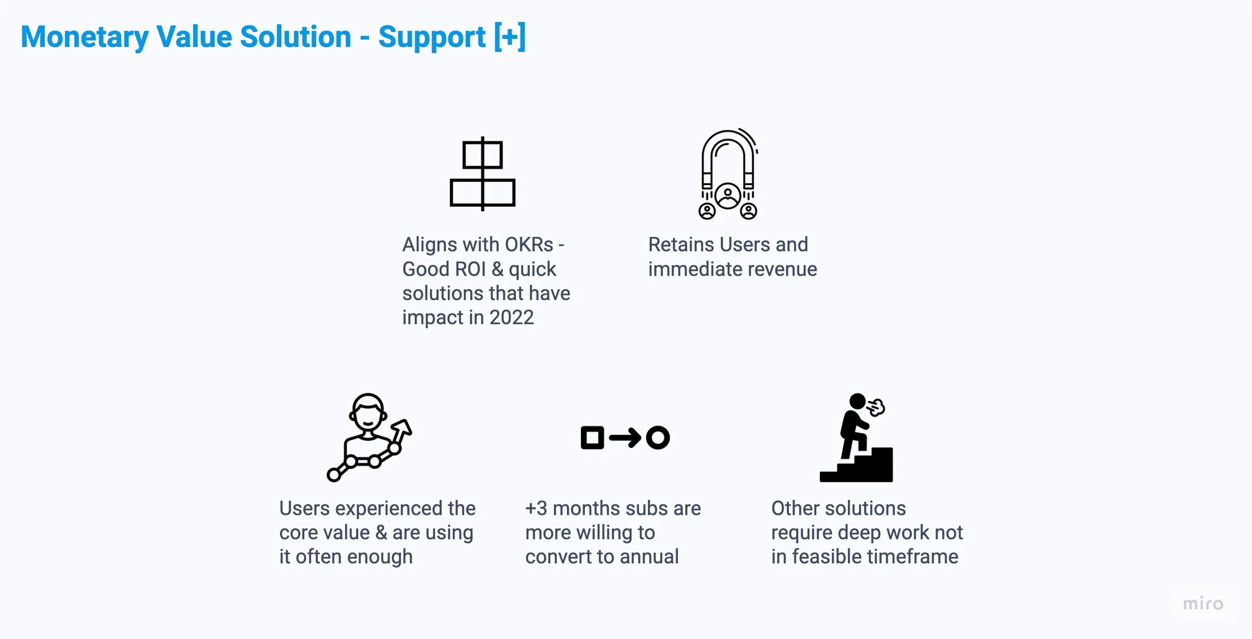
In August 2022 Epic kids refocused the product team’s OKR to prevent churn and retain subscribers. Epic has a huge leaky bucket problem where there were many initial subscribers but saw a majority of Epic Unlimited subscribers leaving after the first few months. We needed solutions to retain parent subscribers and not lose them to early churn. The goal was to find quick certain solutions that shows impact within 2022.
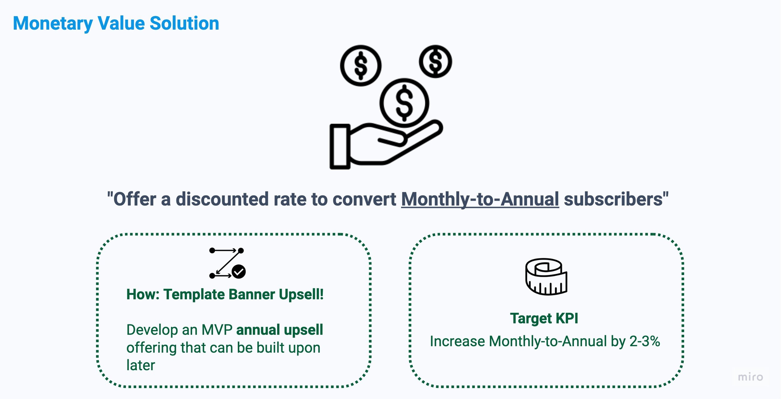
Success Metrics: Increase Mid Term User conversion to annual by 2%. Results of effort are pending.
My Role: Senior Product Designer, Initial work : partnered with another Sr Designer to gather, define issue/pain points. Solo: Defined demographic, the solutions and created all screens for this project. Timeframe 1-month.
Retention Curve for Epic Unlimited Subscribers
Where to Focus on Churn
Insight: We started the project by working with our Data Analyst gathering and analyzing the data on user retention and subscription churn. We verified that the biggest issue occurs within the 1st month followed by users between ~2-6 months. These were key windows to address and has the greatest impact potential. Graph above.
Addressing Which User Segment
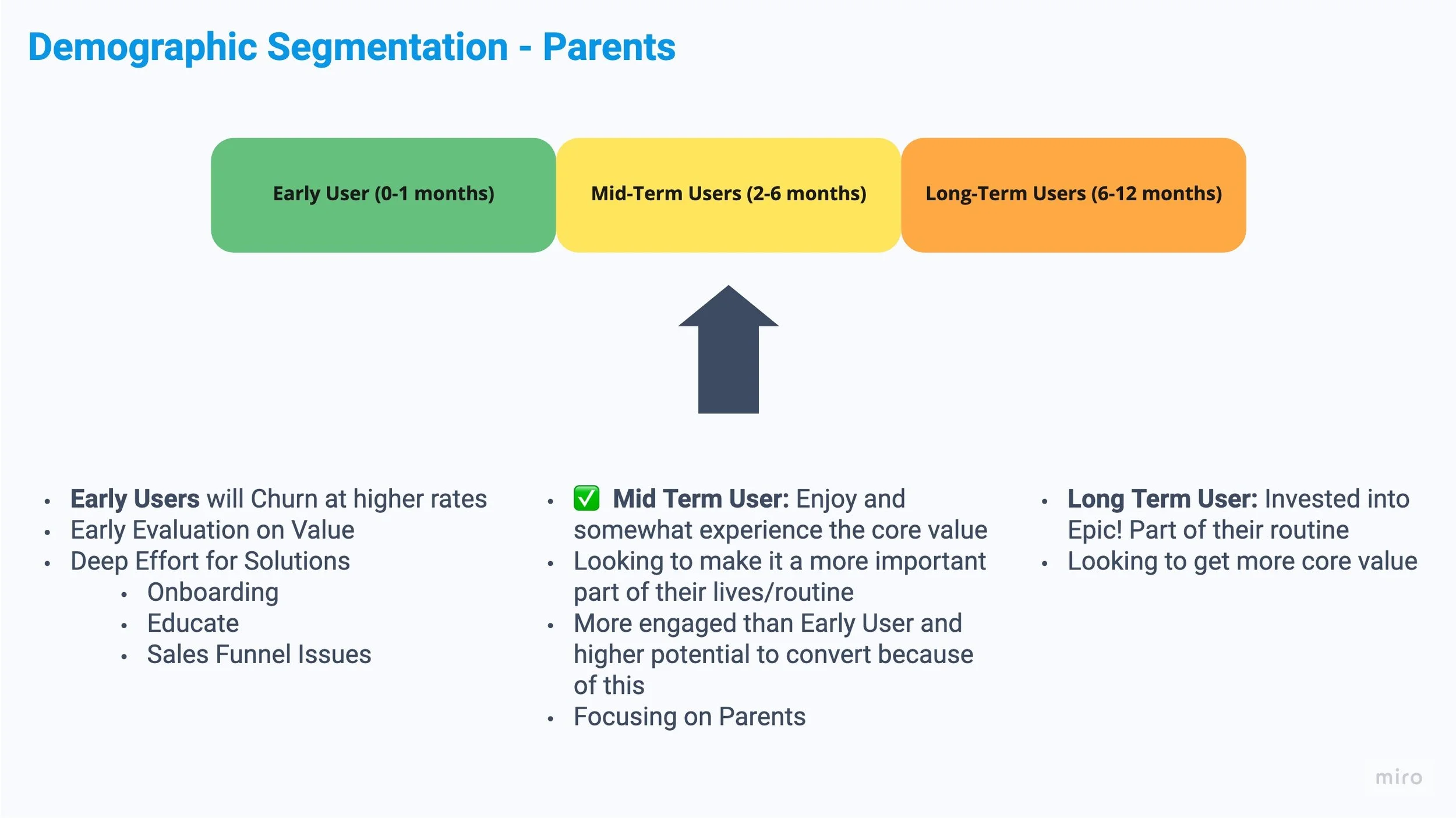
Selected to Focus on the Mid-Term User segment (subscribed 3-6 months). They have the highest potential to retain
Qualitative Data Around Pain Points and Churn
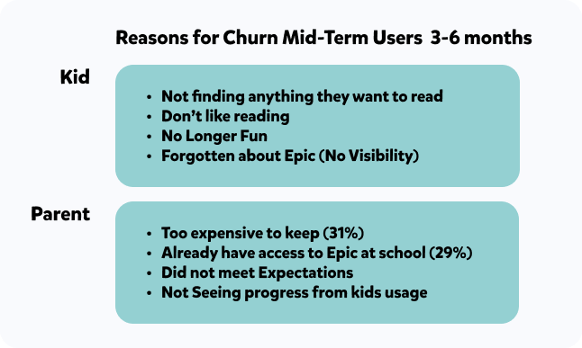
Insight From Qualitative Research Decks:
Exit Survey Results
21'-22' Consumer Satisfaction Survey of users >+ 3 Months
31% of users cited that it was too expensive (value/surface issue)
Big Signal to address value prop/pricing issue for Mid Term Users
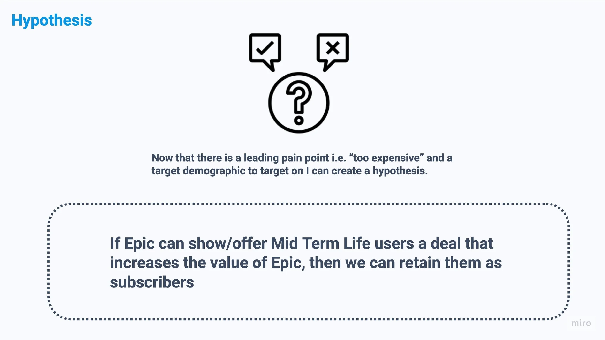
Hypothesis
Proposed Solutions
How might we show/offer more value to the the user?
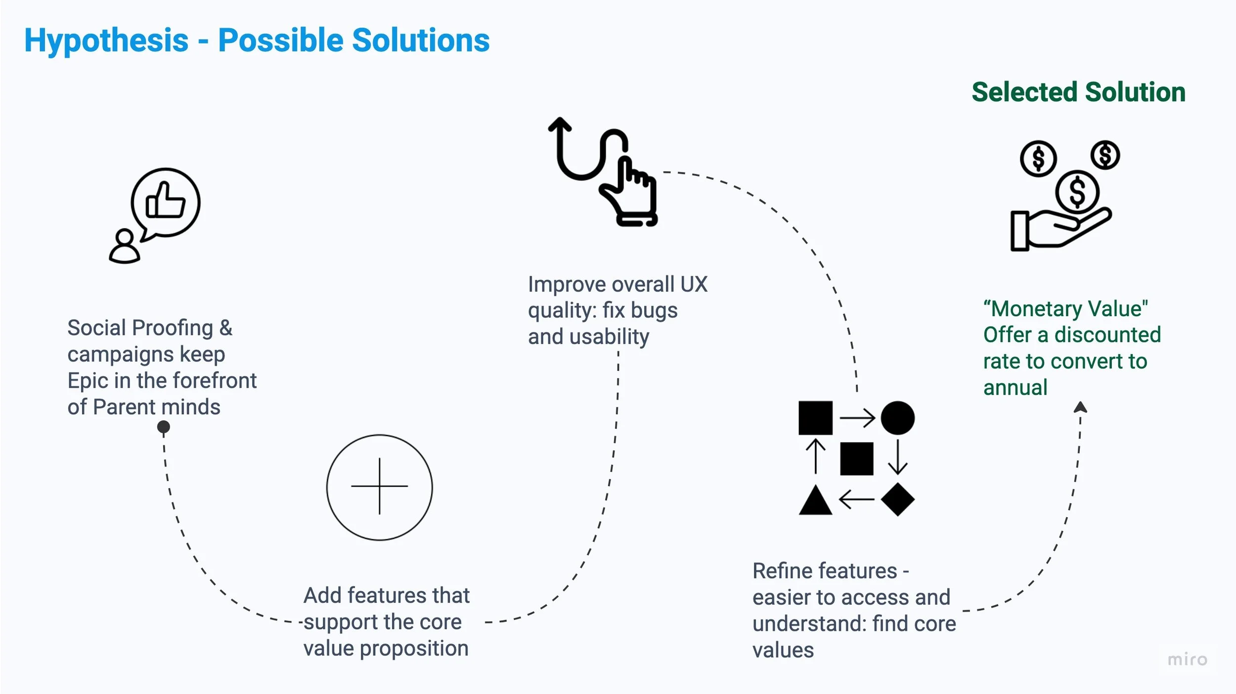
Here is why:
Mid Term Life users experienced Epic’s Core Valuer and are already using it
Mid Term Life users are more willing to convert to an annual plan at a specific time period
Business: Annual upgrades are good: It keeps users & gives immediate revenue the company for a year
Given the time constraint and Need to have a quick certain solution that shows impact in 2022
Dev Time: The other solutions require a lot more deep work not feasible in our target timeframe
Social Proofing and campaigns would cost too much time and effort
Add features like new book send, messaging system need to be big to move the needle
Fixing bugs add value but not enough
Refining features and streamline is close to what we need —> Refine upgrade path
Development and Design Challenges
Here are key areas that needed to be addressed to create the work:
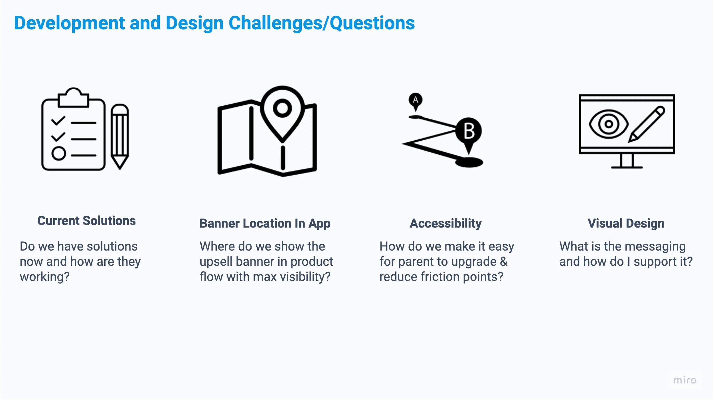
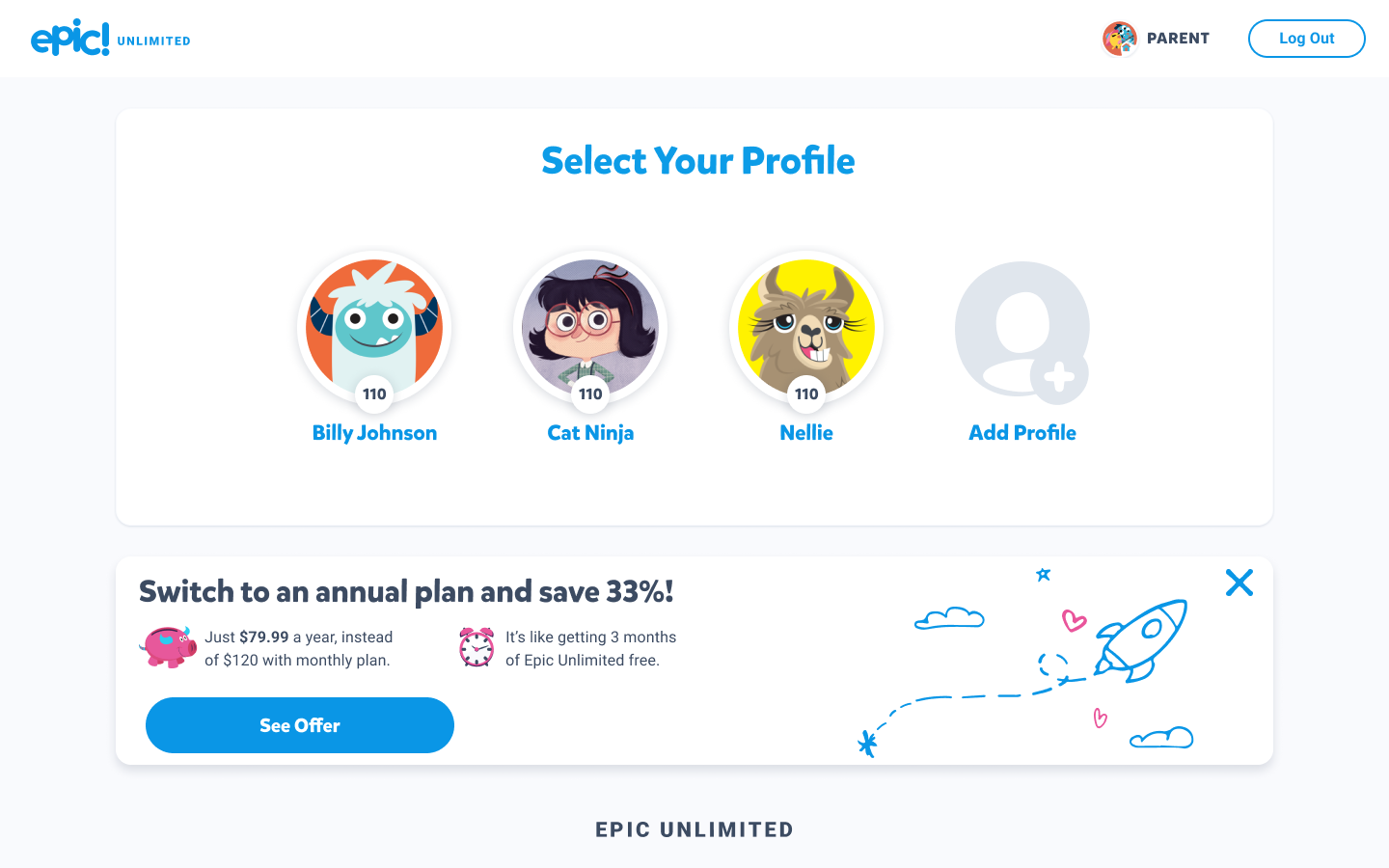
Current Pathways to Upgrade: In-App Audit
To establish the best location to place this upsell In-App, I did an app audit to evaluate the various locations in the app that’s most visible and accessible to parents to upgrade Monthly-to-Annual.
App Audit: Mapping Flow of App and Important touch points (marked by Star). Chosen Location: Profile selection.
In-App Banner Location
Though the best opportunity to reach parents is via email, but we didn’t have a foundation designed in app to link them to the appropriate place once the email CTA is clicked. We needed to build a path before we produced the email deep link route to upgrade.
The MVP goal is expose the upsell banner earlier in the app experience to users who have been subscribed for 3 months.
Placement at Profile Selection Reduces clicks by 40% and most visible when starting the app on iOS (~45% are iOS subscribers).
Post MVP we’d strategically reveal and place the upsell in more locations in the user’s path where we’d get their focus and attention.
Current Offering to upgrade Monthly-to-Annual
Audit of Current Solution Offering:
🤪 Great effort to upgrade to Monthly-to-Annual
-10 Clicks and 2 Login Gates 😮💨
❌ No smart deep linking to automatically route action to upgrade
❌ No campaigns and exposure to upgrade unlimited users
Selected Solution: In-App Banner Location: Profile Screen
Selected Solution: Profile Screen selected location and updated to create the upsell banner template
Alternative locations: Explore Scree (Early-Mid), Activity Screen (Late), and Account Settings (Very Late)
2. Accessibility & Streamline Upgrade Actions
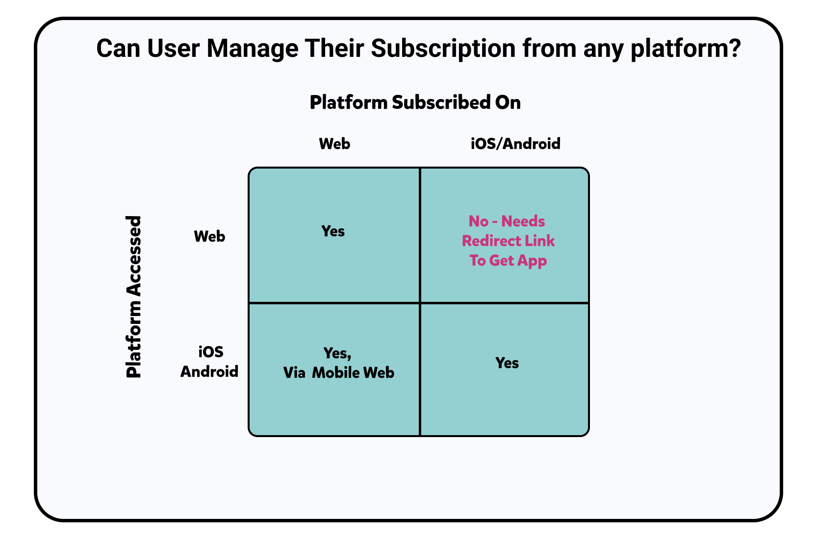
Breakdown to display which subscriptions can be independent of device and which cannot and actions needed.
Epic App can be accessed via any of the platforms: Web, iOS, & Android and in turn allowed users to subscribe/pay from any of those channels. Problem: Crossing payment channels is not possible. i.e. If user subscribed via Web Stripe, they cannot upgrade via iOS in app or Google Pay. (Matrix Above)
I wanted to prevent the user to have to manage and keep track of how to upgrade. I created logic that would route the user to the appropriate paying channel based on platform and initial subscription method or if they didn’t have the app on the device and needed it based on their subscription method they would be routed to get it.
Created Logic Flow on how to move forward to upsell screen to convert to an annual subscriber
Created Desktop Screen Flow Directing User To The Appropriate Upgrade Path
Created Tablet Screen Flow Directing User To The Appropriate Upgrade Path. [Mobile and Tablet are same logic]
3. Visual Design: How should it look like?
Responsive design was needed to accommodate all the different touch points and logic directing as described above. Mobile Web is important to have because most parents will be on that touchpoint to access our app to upgrade to annual.
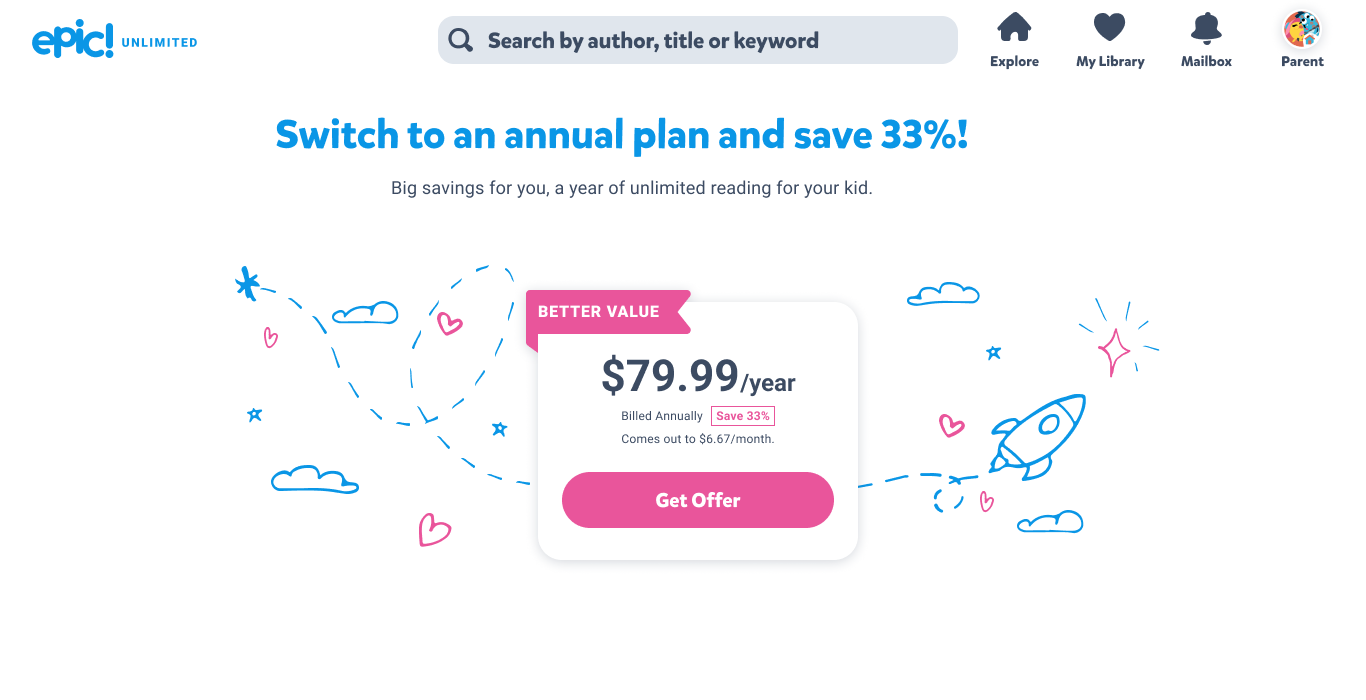
Main Upsell Monthly-to-Annual Upgrade Banner
Offer Page for User to Redeem. Created Layout and art composition.
This page is to protect accident changes and a confirm purchase via stripe payment for Web Subscribers
Transaction Confirmation Screen in app for all three device types. Created layout and art composition.
Support Screen to get the Epic app if user are on a device that allows them to access it. Created Layout and Design
Summary
To align with the company’s OKR to reduce churn my team decided and backed by quantitative data that the best opportunity to do this is:
Target our Mid Term Life Users (3-6 months)
Offer them a monetary value to switch over to an annual plan (33% off monthly subscriptions).
This would increase revenue as well as keep the users on for longer period of time.
To facilitate this effort I did:
An App audit to see what the current solution is to convert Monthly subscriber and improve it
Identify the best place to position the upsell banner. I reduced the the number of clicks by 40% to getting the user to the confirm CTA
Created logic flow and logics to automatically redirect subscribers to the correct payment platform and touchpoint.
Created responsive screens to support the various platforms and allow for a seamless transition to the correct platform or give clear instructions on how to do it.
At the time of this writing we are still awaiting data on how well this effort performed. Our KPI was to increase monthly-to-annual subscriptions to reduce churn by 2%.
I created the layout, composed the art, and overall screen design. Card and Top Nav are part of the design system